PCAP Analysis with Artificial Intelligence
This tool effortlessly analyzes the core features of a pcap file, breaking down the overall trends into easily understandable, graphically displayed statistics. This tool displays information about IP addresses, protocols, and the geolocation of packets to give a more holistic understanding of the traffic. It utilizes manual checking and Artificial Intelligence to predict which packets contain potentially malicious activity by manually checking for suspicious activity within packets. After analyzing that, it uses this information to train the Decision Tree model to recognize malicious packets based on features it recognizes for better detection in future files uploaded.
Here is an example of the features in my model and how it analyzes a file for potentially malicious content
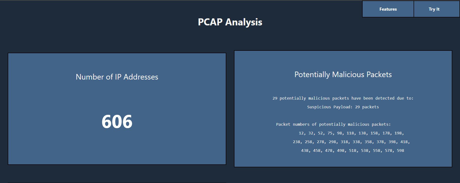
After uploading a file or clicking on one of the pre-processed files, the first thing you see on the PCAP analysis dashboard is an overview of the total number of packets in the PCAP file and the potentially malicious packets found. The potentially malicious packets feature indicates the number of packets recognized as potentially harmful, why they were classified as potentially malicious, and their packet numbers to make it easy to locate and understand the indicated packets.

The following two sections provide the output of the decision tree model used to further analyze the network traffic file. The AI Statistics feature contains information about the accuracy of the model's predictions, and the Decision Tree Visualizer feature provides a helpful visual representation of the features used and the decision tree crafted by the model to predict the state of each packet.

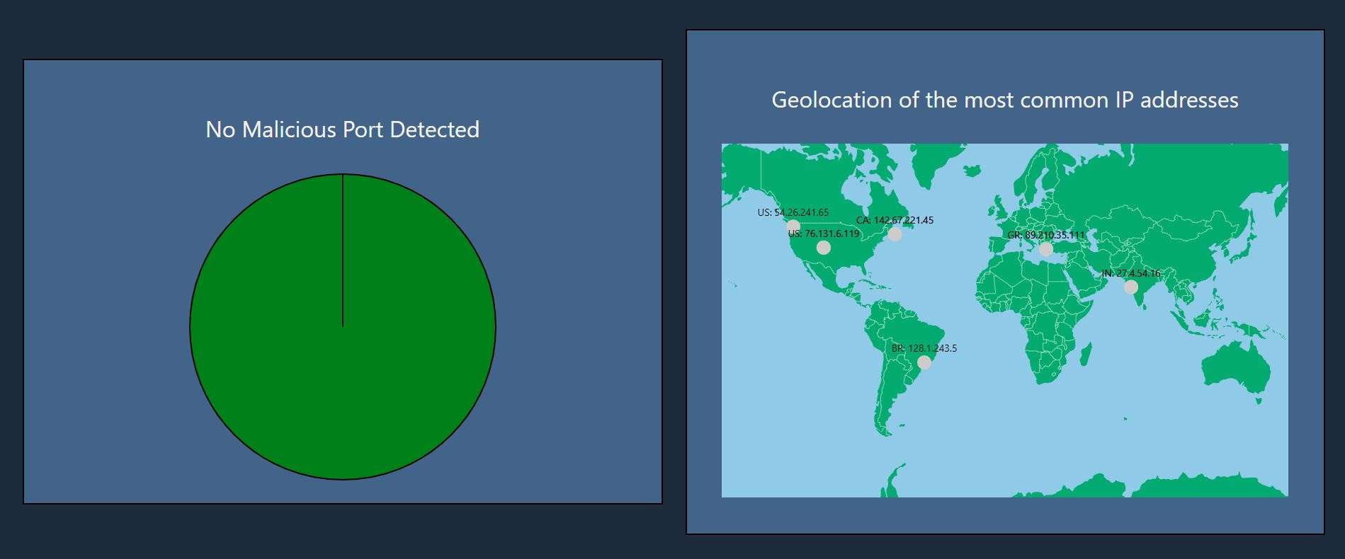
The next feature displays the number of malicious ports, a set of ports that tend to be used for malicious activity, found in the provided PCACP file. This list provides a better understanding of the source of the suspicious activity. There is also a feature displaying the geolocation of the most common IP addresses, which provides a geospatial understanding of the origin and destination of where the data is going.

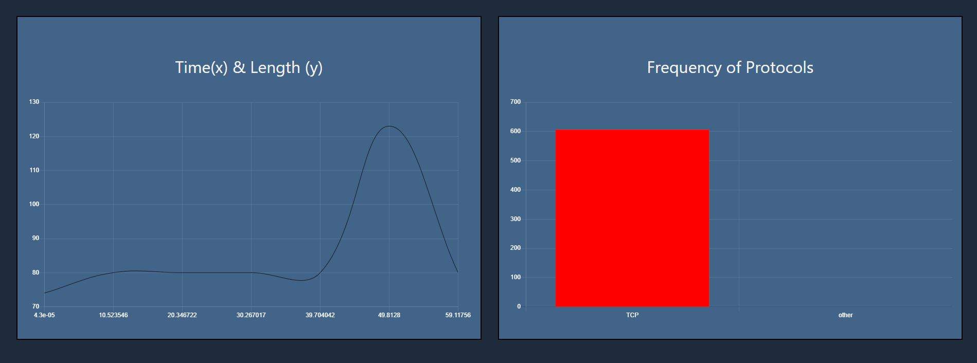
The time/length graph feature is used to understand patterns regarding the flow of the data through the network. Unusual spikes and variations can also raise suspicion over packets. Additionally, the bar chart displaying the frequency of protocols can provide a holistic view of which modes of transport are primarily utilized in this network capture.

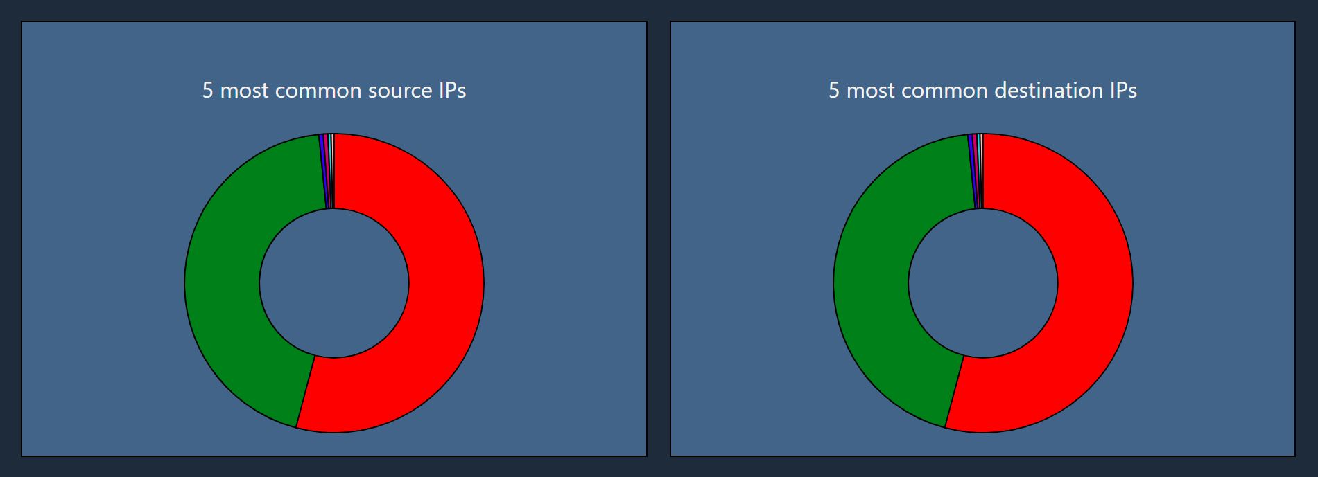
The last two features use a pie chart to display the five most common source and destination IP addresses. This feature is useful to understand the overall main interactions throughout the PCAP file.
